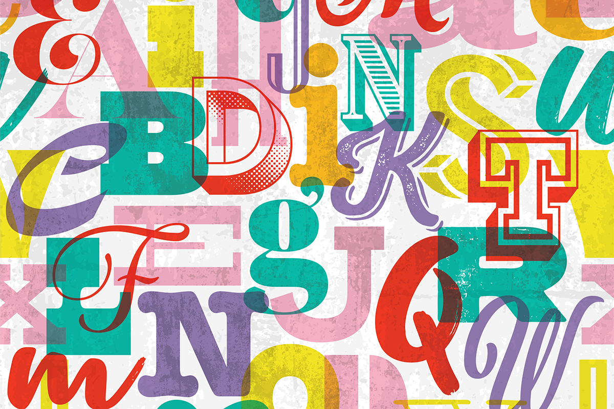
Typography is an essential element of design that can make or break your brand. Choosing the right fonts, arranging them harmoniously, and using them consistently can elevate your visual identity and convey the right message to your audience. Below are some best practices in typography that will help you create a captivating and impactful brand presence.
Start with the Right Typeface:
Choosing the right typeface is crucial for establishing your brand’s personality. Consider the emotions and values you want to convey and select a typeface that aligns with your brand identity. Whether it’s a classic serif font to evoke sophistication or a modern sans-serif font for a contemporary feel, make sure it resonates with your target audience.
Simplicity is Key:
Simplicity in typography can have a tremendous impact on the overall design. Avoid using too many fonts as it can create confusion and dilute your brand’s message. Stick to two or three fonts at most, and ensure they complement each other and maintain consistency across all marketing materials.
Prioritize Readability:
No matter how visually appealing your typography may be, it’s important to prioritize readability. Ensure that your texts are legible across different devices and sizes. Experiment with font sizes, line heights, and letter spacing to find the perfect balance that makes reading effortless.
Hierarchy and Emphasis:
Hierarchy plays a crucial role in guiding your reader’s attention. Establish a clear visual hierarchy by varying font weights, sizes, and styles. Use bolder or larger fonts for headlines and subheadings, and lighter or smaller fonts for body text. Emphasize key parts of your message with italics, underlining, or different colored fonts.
Consistency is Key:
Building a strong brand identity relies on consistency. Once you’ve chosen your typefaces and established a typography system, stick to it across all your brand touchpoints. Consistency in typography helps build recognition and creates a unified brand experience for your audience.
Use Contrast to Create Impact:
Typography is not just about choosing the right typefaces; it’s also about utilizing contrast effectively. When designing your layouts, experiment with contrasting font sizes, weights, and colors to create impact and draw attention to important information.
White Space Matters:
White space, also known as negative space, has its own importance in typography. Leaving enough breathing room around your text helps enhance readability. Don’t be afraid to let your text breathe and give it the room it deserves.
Typography is a powerful tool in branding and design. By following these best practices, you can create a visually stunning and cohesive brand presence that captures the essence of your business. Remember, typography is not just about aesthetics; it’s about effective communication. So take the time to choose your typefaces wisely, craft a strong hierarchy, and maintain consistency across all your design materials.
Not a DIYer? Take your brand to the next level with Odessa Design. We’ll guide you through the world of typography and other essential branding elements. Contact us today!
No Comments